In what ways does your media product use, develop or challenge forms and conventions of real media products?
The genre of Alice in Videoland is Electroclash, which is not a popular genre, but it can also fit with powerpop, and electronic pop or dance music, using synthesisers and drum machines along with voice. This genre of music fits with bright colours, crazy, fluid shapes and is quite an eccentric and diverse genre of music. I have incorporated colour into my video as this fits with the genre, using the spectrum to make parts of the video stand out more, also flashing quickly between a range of colours to create an almost disco-like effect, keeping in pace with the song. Electroclash is about being outgoing, standing out, so I used some very definitive stereotypes within my narrative, the Cutie, the Goth and the Punk.
Having a more controversial genre for my chosen song made it more difficult as I didn’t have as many current music videos to relate to for my inspiration, but the videos that I could view consisted of mostly narrative, with some performance and lip-syncing within the narrative, such as the video to The Tears, by Robots In Disguise, or Alice In Videoland’s Going Down. My music video uses typical techniques from the majority of standard music videos, such as meat shots throughout the video to establish the characters, to create a “face” for the artist, for the product. My video focuses on narrative, without the performance, which most videos do not, and mine also included animation. I have seen some music videos with animation, but not that many, but I think that it fits with my genre perfectly, and it makes the music video stand out amongst others.
Rather than alienating the audience completely, I have followed some conventions of a general music video, with the narrative and lip-syncing, and my music video is a mixture of Amplification and Illustration, with some scenes relating directly to the narrative and some more surreal shots, matching the editing of the cuts to the beat of the song. However, for my music video to be more unique, I have challenged some of the conventions, not including performance, and using cartoon images for some scenes as well as the motion paths for the cartoons within the main body of the video. I feel that this made my music video stand out more, and made it more interesting and enjoyable to watch.
How effective is the combination of your main product and ancillary texts?
I think that my ancillary texts and my music video work well together, as well as my blog, with the layout. My ancillary texts match each other, using the same colour schemes and techniques, as well as the same character, and the character on the ancillary texts is the same character in the animation of the music video. I drew the character for the animation based on photographs of Carrie, my actress for the video, to ensure the animation would be convincing, and I based the sketches for the poster and DVD Digipack on Carrie, as well as an ideal character I have created. I have also used the same fonts between the ancillary texts, and the cartoon theme is in use throughout all of the products. There is a strong contrast between colour and black on all of the ancillary texts, all of them look striking and exciting, and they all resemble real media products. The colours used on the webpage are the same as used on the Digipack, and the poster, so any product related to my music video would be easily recognisable. For example, if you see the magazine advertisement for the Digipack, then go into a music shop looking for it, it will stand out and you would recognise the style and design from the advertisement. All of the ancillary products are closely related, and the actress used in the music video is shown on the advertisement, as well as the cartoon character on the Digipack, so the character is instantly recognisable, which increases the familiarity for the products. Personally, I feel that the design and creativity in my ancillary texts, as well as the features and style of my music video, come together to form a complete media product, which would be attractive to the consumer, and stand out from other media products.
What have you learnt from your audience feedback?
To gather feedback, I posted my video on YouTube. The feedback was generally very positive, and people really enjoyed the mix between the cartoon and the rest of the music video. They found the video enjoyable to watch, and the narrative was interesting with the different characters. It was commented that my lip-syncing was “spot on”, and the editing was done well. People thought the editing suited the narrative, and the style of music, with some fast edits and a wide range of camera shots, some with colours applied to the frames, which people liked. The song is colourful, and this fitted well with the genre. The use of one actress as a number of characters made it more interesting, as you could see the contrast more clearly. Although it was a slight risk, me choosing a song from a niche genre, and not following the conventions of other genres, it meant that my music video was unique, it stood out more amongst other video, and current videos, and I feel that this had a positive outcome which I have benefitted from.
How did you use new media technologies in the construction and research, planning and evaluation stages?
I documented my research and planning on a blog, which is more efficient and easier than using a physical file. A blog meant that I could access my work anywhere, at home or at college, and there was no risk of me losing a physical file. On my blog, I also embedded videos from YouTube of the current music videos I had analysed, as well as scanning in sketches of initial ideas and inserting these images onto my blog, such as my initial mind map and sketches for the Digipack cover. The appearance of my blog is very colourful, which matches the rest of my products, and it also uses to contrast between the black and the vibrantly coloured shapes to form the background.
[INSERT SCREEN GRAB]
Using cartoon images for part of my music video brought me a lot of opportunities to use different technologies. For each cartoon image, I took a photograph of Carrie in each location, at each scene, then sketched images from the photographs. Using the line images, I scanned them into my computer.
[SHOW IMAGE OF LINE ART]
I then coloured each photo using Photoshop, trying to match the colours to reality as well as making them vibrant and in the style of a comic. I leant how to use lots of different effects and tools on Photoshop, including the Burn tool to create smooth shading and the effect of shadows easily.
[SHOW IMAGE OF COLOURING]
This then gave me an image that I could use with my filming, edited in with my other shots. Some of the cartoons I drew were traced from stills from my filming, and these shots were merged into the moving images of my filming. The fact that I traced them, and then scanned and coloured them using colour swatches from the original stills meant that the transitions were seamless and smooth.
[INSERT CARTOON INTO FILM]
During the music video, there are some cartoon images within the live action, such as the bird coming into the scene, and the cartoon background with the sky moving in the background. The sky moves using a motion path.
[SCREEN SHOT HOW TO DO MOTION PATHS]
I have used lots of layers to create this image, the sky, the trees, the character and the bird are all separate layers with some areas of transparency to show the other layers through.
[INSERT SCENE]
Layers have been used throughout the entire music video to ensure that each frame is in the correct place, as well as to use other cartoon images over the film, such as the “A.S.A.P.”, and the speech bubble with “I’ll kill you”, which appear as the lyrics are sung, and Carrie lip-syncs.
[SHOW SOME ANIMATION/FILMING]
Using Final Cut was a definite advance from iMovie, and it provided me with a lot more allowance for creativity during the editing. The motion paths meant that I could make most of my ideas work, and my cartoon frames were not just still shots, because I could use the motion paths to make the frames into zooms and pans. Also, using Final Cut meant that I could easily put a colour over the images to create a more surreal, interesting effect. The flashes of colour make the video more exciting and make some shots stand out more from others, and these effects were easily applied using Final Cut.
[INSERT SCREEN GRAB HOW TO DO IT]
[INSERT FRAME OF COLOUR FLASHES, CHAIR?]
I also found Final Cut a lot easier to use than iMovie, though it was a little complicated at first, it was easy to get used to. Experimenting with the features of Final Cut helped me to find various effects and transitions which contributed in giving my video the overall look and feel it has, unique and exciting.
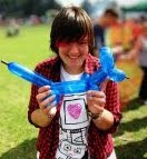
For my ancillary tasks, I took various photos of Carrie in different costumes, for each character, and then chose some photographs for the main image on the Digipack and the magazine advertisement. The smaller images shown within the photograph Polaroid frames are some of the other images of Carrie, as well as some photographs of Carrie and I, in significant styles of dress and make up, which I feel contribute to the images as a whole, making it look more fun, and showing friends together, which is a positive image.
My final Digipack cover is very similar to my original design that I sketched.
[SHOW ORIGINAL SKETCH]
But I manipulated and changed it by adding the character. Originally, I sketched the character roughly, then added the rest of the Digipack cover around her, with the cloud and the monsters from the front cover.
[SHOW SKETCH]
From this, I then traced it on my light box so I had a raw black and white line image, which I then scanned into the computer.
[SHOW LINE IMAGE]
Just like my other cartoon images, I coloured it in on Photoshop to achieve this final image.
[FINAL IMAGE, ONLY CHARACTER]
The cloud and the monsters were created on Photoshop, using the shapes and the drawing tools, and the gradient tool to create shading and a varied tone across each image. These monsters appear on the Digipack cover and the colours used match the colours on the other ancillary tasks and my music video.
[SHOW FINAL DIGIPACK COVERR]
As a conclusion, I feel that my technical skills within media have improved with this task, and I have broadened my range of programs and effects. I enjoyed making my music video, planning, filming and editing, and I am happy with how my final music video and ancillary tasks have turned out.